[TOOL] A better way to track blood test results
Over one year ago, I made the decision to start focusing on my bloodwork. I had just gotten the first comprehensive metabolic panel in years, and the results weren’t great. My liver enzymes ALT and AST147ASTNormal: 10–40 U/L71ALTNormal: 9–46 U/LSource: LabCorp, March 2025 were extremely high, in such an embarrassing way that it basically screamed this person drinks too much alcohol [1]. I realized that a bigger effort was needed if I was going to take charge of my health.
I started by looking at the data. Luckily for me, I’ve always had some sort of a focus on health, and I already had some two-dozen PDFs of blood test results dating back to 2018 in a folder on my computer. Every time I would get one, I’d save the results from the doctor as a PDF and drop it into that folder. While it was great to have, it was a mess to actually go through. I really wanted to make some comprehensive Excel spreadsheet with all of it, but assumed it would be too much work for one person to do.
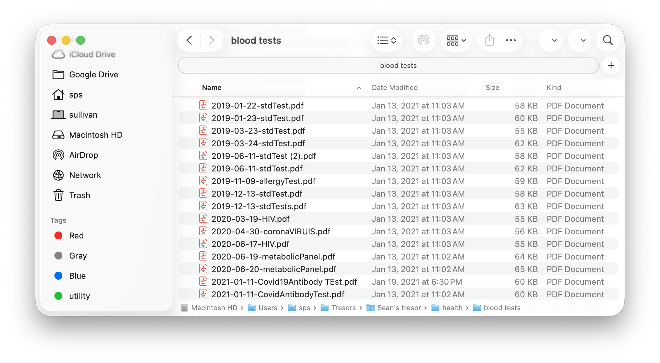
My Plan
My plan was pretty simple, just:
- Command Claude or Codex to delegate an army of subagents to process all my PDFs
- File by file, comprehensively pull all numeric and non-numeric test results out
- Create a master datasheet with all these results
- Run a separate set of agents to check the first agents’ work, and report any inaccuracies they find.
- Create a central dashboard to read and manage all my blood test results
It’s a lot. But since AI resources are virtually infinite, I was confident that it could be built.
How it went
Steps 1-4: Data conversion
This was honestly easier than I expected. Claude and Codex both did a great job dispatching agents and converting the blood test results into an Excel sheet. The cool part is the verification bots didn’t find any actual errors, they just flagged places where the wrong units were used, like an ALT test from 2018 in ng/dL while the 2020 ALT was in ug/L. I did a manual spot check across the whole dataset and it looked great.
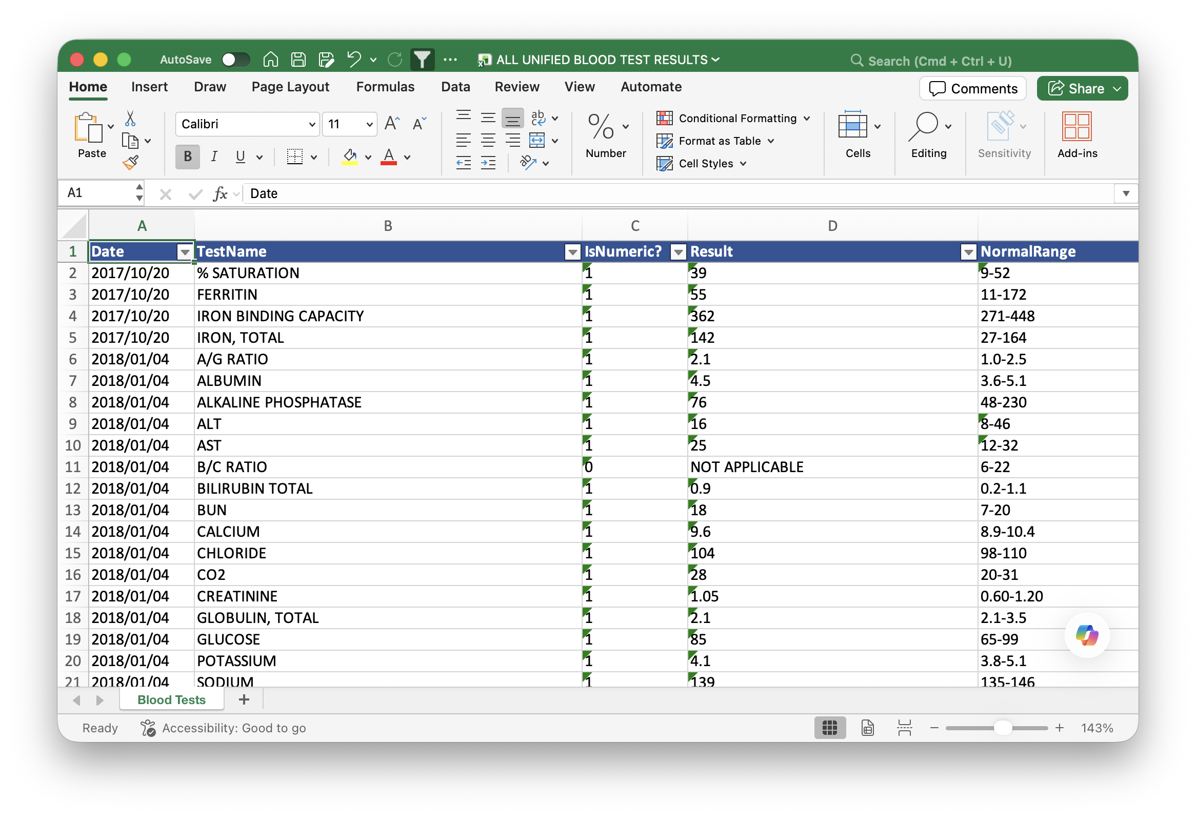
Step 5: The Dashboard
With the data in some kind of usable format, this was the part where I had some fun. I started by asking Claude and Codex to both design a rudimentary visual for the labs. My idea was pretty simple. It would have a dual layout, card-based and list-based, where you pick between the two views and get either one card or one list item per blood test. They always show the most recent result and its unit, and they’re color coded green or red depending on whether the result falls outside the normal range.
Note
But what counts as a ‘normal range’? Depends who you ask! My results often showed different reference ranges for the same test across the years, which I mostly chalk up to the slight differences in how LabCorp and Quest Diagnostics calculate their normal ranges. Within a single company I didn’t see much variation.
Either way, I built a system to handle it. Each blood test record, both in my backend database and in my spreadsheet, includes the reference range the lab gave me at the time of the test. The web UI parses this and shows the most recent range. These tests don't always come with a range, so the site keeps crawling older and older records until it finds one, and that’s the reference you see on the display.
The Frontend
Claude iterated on my design a few times, and the early prototypes were ugly. Inspired by the latest iOS update and wanting something a bit better than flat, I pushed the AI toward a glassmorphic UI. I’m really proud of how it turned out.
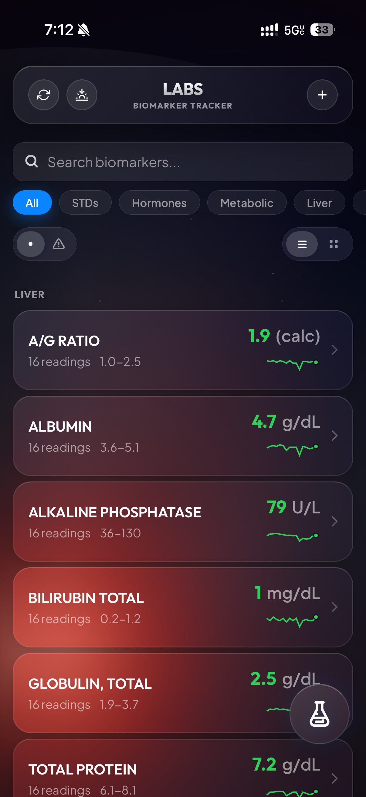
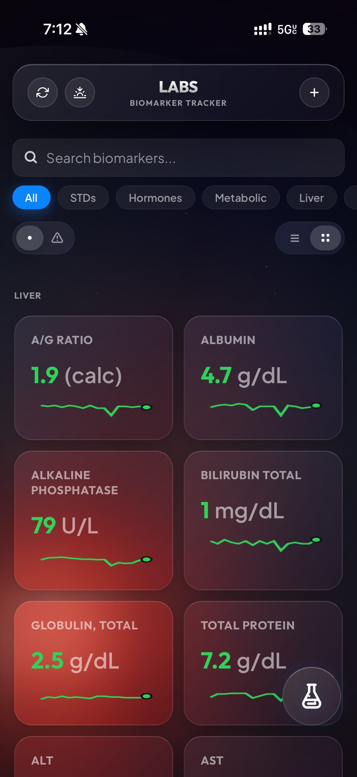
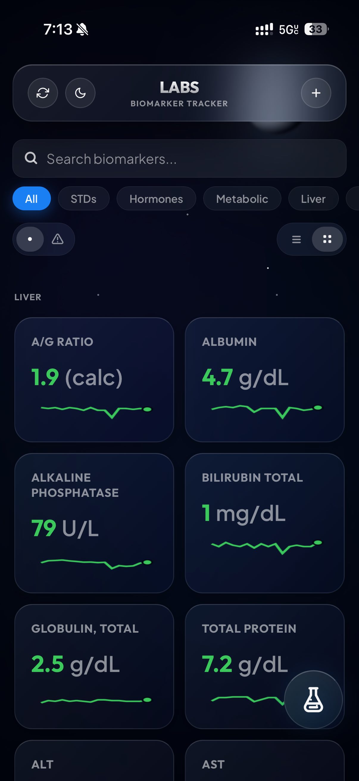
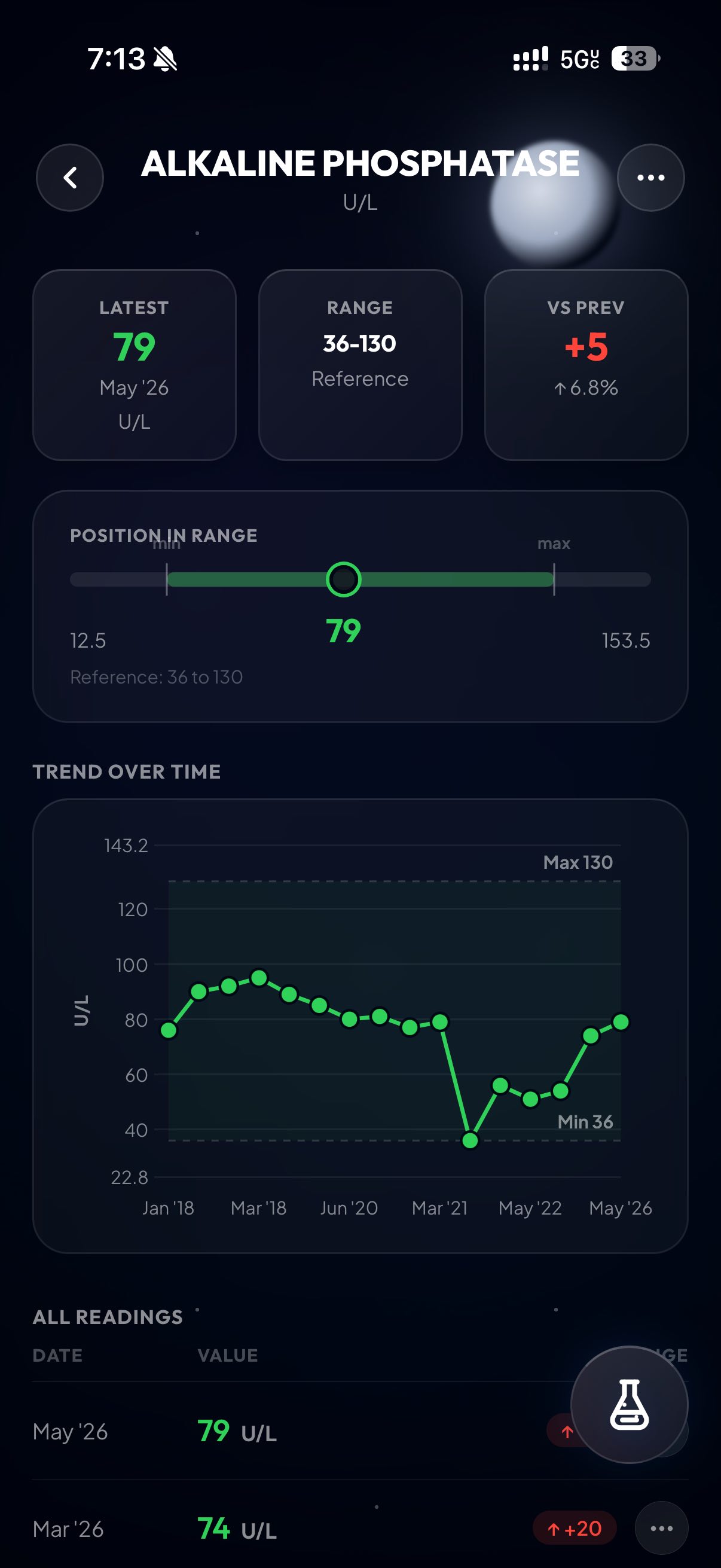
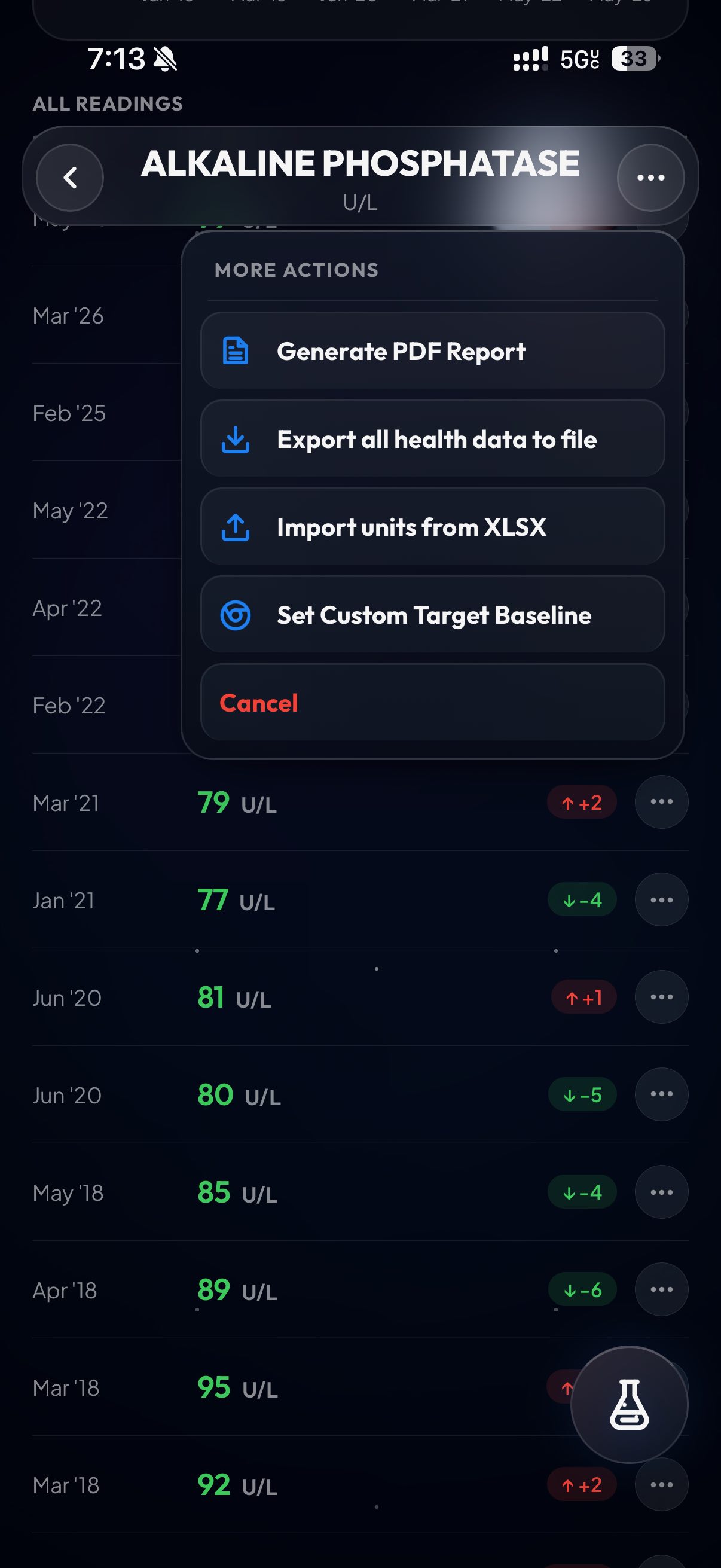
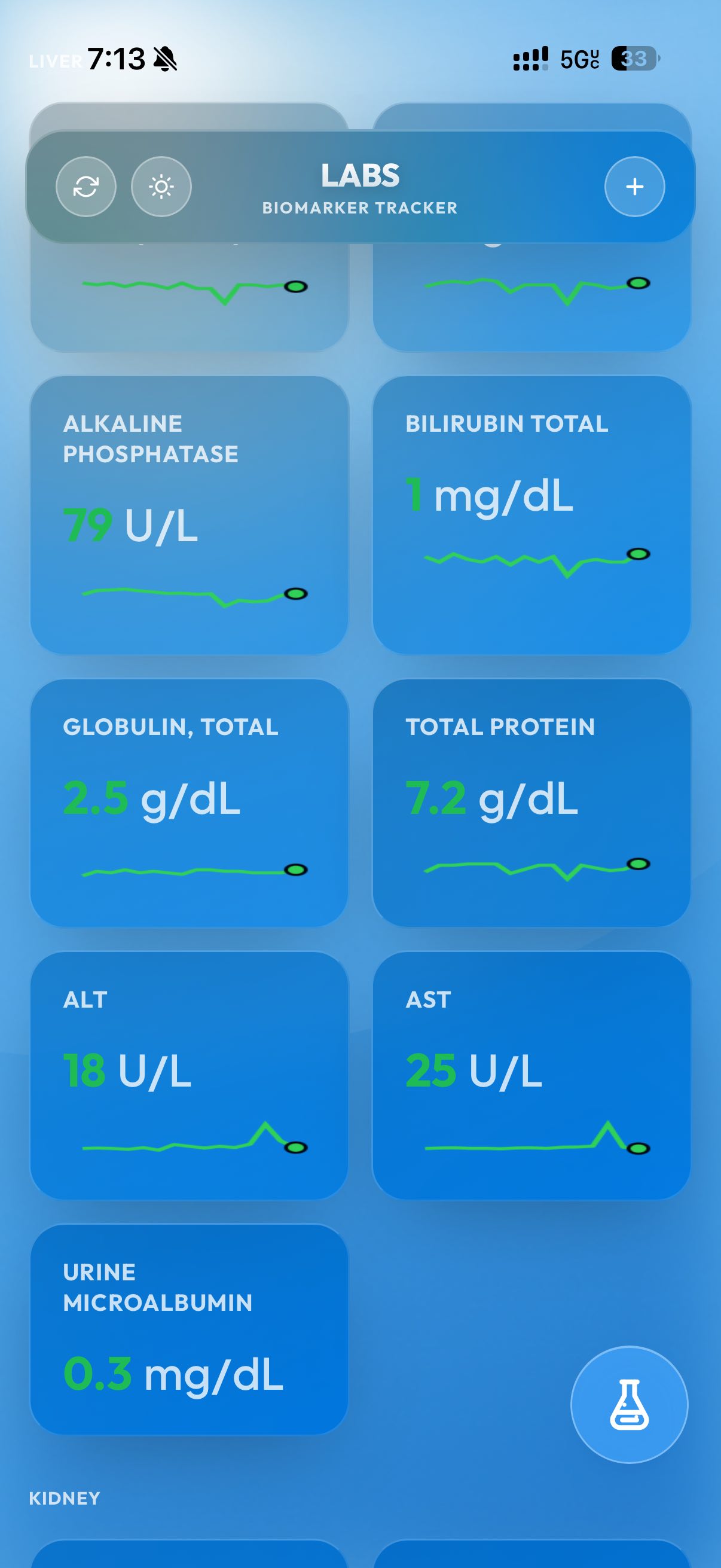
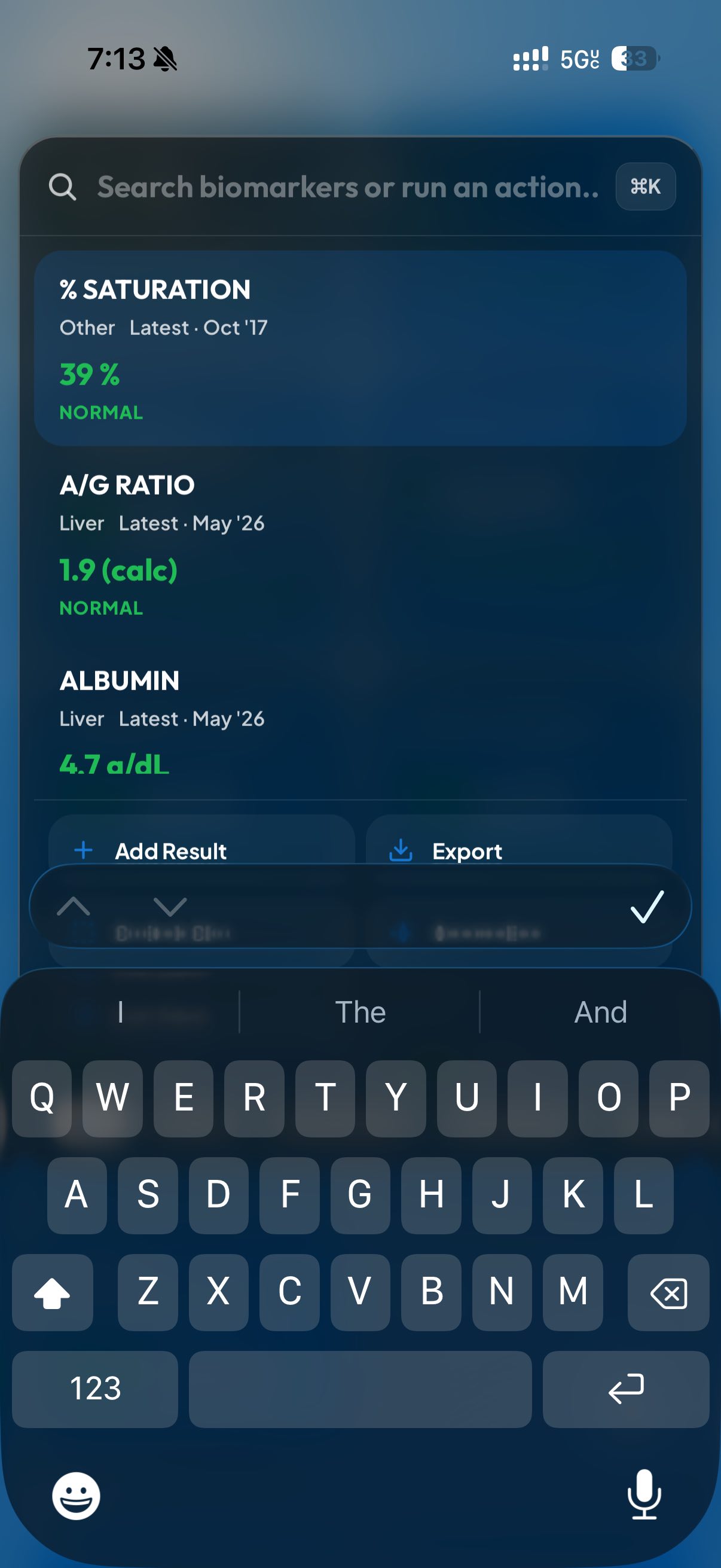
Once I finished, I spun up some more Claude subagents to do bug catching, and in the middle of that one of them suggested a new feature I really liked. That’s what you’re seeing in the last screenshot, actually. It’s a power menu that’s triggered by tapping the little flask on mobile or hitting Cmd+K on desktop. When you open it, you can instantly pull up test results, create an export PDF, or even add a new lab. It’s really powerful and designed to be my place to drop in when I need to locate a result as fast as possible.
That’s pretty much the entirety of the UI. I really loved designing it, especially the glass background. I was going for an imitation of Apple Weather, and I think we (me/Claude) nailed it.
The Backend
For backend storage I went with Google Firebase. The only real alternative people seem to be using nowadays is Supabase, and that has an awful free tier. Google’s looked better for the long haul. But since Google prices based on # reads, the data model I ended up with is honestly pretty funny.
Firebase gives you 50K reads/writes a day for free. After that it’s some absurdly low rate, like $0.03 / 100K reads (i think). The other great thing is the 1MB data record limit. 1 megabyte! 😂 That’s about 1 million characters. For reference, the Great Gatsby comes in around 240,000. My blood test results are never going to be as long as the Great Gatsby, so therefore I decided to store my entire database in one Firebase entry.
It’s safe to say that this setup will never cost me a dime. The only remaining question is what the data will look like when we send it to Firebase. I iterated with Claude, and we settled on the following schema for a master format:
  {
    "schemaVersion": 1,
    "tests": [
      {
        "name": "string",
        "unit": "",
        "range": "",
        "type": "",
        "points": [
          {
            "date": "YYYY-MM-DD",
            "rawResult": "",
            "lab": "",
            "sourceFile": "",
            "testResultId": "",
            "rawRange": "",
            "unit": "",
            "sourcePage": "",
            "reviewStatus": "",
            "verificationStatus": ""
          }
        ]
      }
    ]
  }
This schema looked pretty good. I sent it to firebase, but then realized I just stored private health data in plaintext, which is stupid. It definitely needed to be obfuscated. I thought about just encrypting the values themselves, and leaving the json keys themselves plaintext. But that is also pointless since the metadata (test name, test date) matters just as much. So I settled on a Base64 AES-GCM ciphertext of JSON.stringify(vaultData), which turns the whole thing into a string and encrypts all of it.
With that, it finally looked good. I wired up the Firebase integration and ran a one-time script to push all my data, and it worked on the first try. I’ve been using this site ever since then to track my test results.
The firestore database has essentially become my new source of truth. I still make regular exports so there’s the Firestore database and a Excel sheet running in parallel, giving me dual sources of truth. It’s a little extra effort, but I want to be protected in case something gets mangled in the database and my data becomes unusable.
Closing thoughts
This project was genuinely a lot of fun. I reach for the web app whenever I need to look up a blood test value, and whenever I bump into a new bug or feature idea I can just build it. Over time I’ve added a ton of functionality, and it’s become a really solid home for my data. It’s also easy to share it, making conversations with doctors and family much easier. I might publish this web app to Github if there is interest, but for right now it’s just a happy webapp that sits on my phone.
It also helps feed my obsession of actually trying to optimize these numbers. Since creating this dashboard, I actually did a whole project where I used it to help dial in my supplement routine and help out my liver. If you’re interested, feel free to take a look at that here.
References
[1] Per NIH, https://pmc.ncbi.nlm.nih.gov/articles/PMC4155359/: “In most types of liver damage, ALT is higher than AST. However, in alcohol-related liver injury, the enzyme AST is typically two to three times higher than ALT. An AST-to-ALT ratio greater than 2:1 strongly suggests alcohol is the cause.”